
“I’m not confused. I’m just well mixed.” ~ Robert Frost
One of the most requested topics when I’ve run Excel upskilling sessions has to be Pivot tables. When asked what people want to do with them the typical reply is something like “I just don’t get them.” Do you find yourself saying or hearing this as well? Lets dive in and have a look at pivoting data.
The general perception of the mystic and arcane knowledge that surrounds pivots seems to be somewhat unique to the subject. Most things are either simply “known” or “unknown” but pivots repeatedly fall into this uncanny-valley where people know they exist but fear to tread.
I would like to dispell the fog of fear that surrounds using pivot tables somewhat. I’m not going to deny that there is something of the ‘other’ about them; they certainly behave quite differently to lot of the more commonplace elements Within Excel. Nor will I say that there isn’t complexity in the subject that would largely fit under the title of “Using Pivot tables”, there certainly is. However, there’s complexity in any sufficiently rich subject, that doesn’t mean it’s all complicated. Excel itself has a very deep well of potential learning but most people in professional office environments have no problem picking it up and making it work for them. The same can very easily be done with Pivots.
I think the key issue here is understanding the concept of Pivot tables. When people first start using a spreadsheet they may not understand the concepts of relational referencing, variables or function arguments, yet you can quickly show someone how to SUM the values in a column of data and they ‘get it’. Unfortunately the step up to comprehension of pivots is a little higher. Not so high that anyone who uses data fairly regularly isn’t going to ‘get’ without too much thought and absolutely no training.
This isn’t a situation unique to people who don’t use Excel a lot either. I’ve often found people who were perfectly competent and even highly skilled in many areas of using the application in their daily tasks that had never looked at pivots; regarding them as some super-user function similar to writing their own VBA macros. This is a shame as in a lot of cases these very people could have saved themselves hours of frustrating and repetitious effort with a simple pivot table now and again.
Simply experiencing what the word ‘pivot’ refers to is generally all it takes. How data changes from one shape to another. If you tell someone that it turns ‘tall thin’ data into ‘short wide’ data I don’t think it’ll do anything for the blank look they may be giving you. However, if you show them exactly that, I find a look of comprehension is very quickly followed by one of ‘seriously, is that it?’
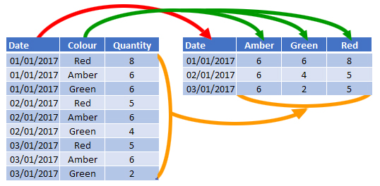
Above, on the left, we have a table with three columns: Date, Colour (yes, I’m British) and Quantity. This is a nice way to store data but not always great for comprehending it. The Date column has three unique dates in it but without looking through that’s kinda hard to see. Clearer is that there are three colours but then this is only a small table. The table on the right has ‘pivoted’ the same data so that the Date column has a row for each unique date only and similarly, for each colour within the data there is a column. This forms a grid into which the Quantities can be displayed and referenced against Date and Colour.
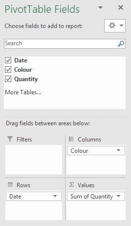 When you create a pivot table you are essentially doing the same thing. However Excel will create the table and dynamically resize it for you based on the data and how you want to display it. The image to the left here shows the same groups as in the tables above and you can see how I have told Excel to put the data from the Colour column into the columns of the pivot table, the Dates into the rows and the Quantities as values (the bit in the data grid).
You might have noticed that this value box has Sum of Quantity. This is because as well as organising your data, pivot tables are excellent at aggregating it. In our example we only had one value for each Date and Colour pair. That needn’t be the case, in fact it rarely is. You may have several of one colour for a single day, for example. In this case the pivot will naturally SUM all the matching values. You can ask it to aggregate in many other ways (Average, Min, Count…), although SUM is the most commonly useful.
That’s pretty much it. That core concept of transforming, flipping, rotating… pivoting the data from one shape to another is all you’re doing. From here the best advice I can give anyone who’s just had their mind blown is to play about with some data. See what happens. Try moving things into different boxes (where it handily says “Drag fields between areas below:”) Try adding more data and grouping the dates. Add a new category to the original data. Put more than one field into the same pivot area. Play. Have fun.
A couple of tips:
- Each time you update the source data you need to refresh the pivot table (right click). This is because the pivot table runs off a hidden copy of the original. This is actually very handy but that’s not immediately obvious.
- The default pivot table style is, to my mind, far from the best. Play about with the styles in the Design tab. Also, I suggest that as soon as you create the table you change the report layout to Tabular Form – it just makes so much more sense. Design Tab > Report Layout > Tabular Form.
Hopefully this has helped you or you will be able to pass it on to someone who is in the situation we talked about at the start. There’s no need for anyone to fear pivots. Better we make our way, undaunted into a new area of learning. Strike boldly and unleash the power of pivots!