“If you don’t know the answer, just guess and use two decimal places. Nobody will question it.” ~ Anonymous previous manager of mine
As analysts I’m sure we all feel the draw to improve the accuracy of any figures we provide. It’s all too easy, however to confuse precision with accuracy. Unfortunately this is at least as true for the people we deliver to as it is for us. I wouldn’t advocate following the advice in the quote above (despite having received it myself!) but it is all too likely to be effective… for a while.
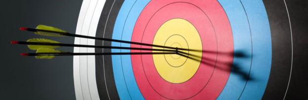
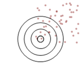
The classic illustration of the difference between the accuracy and precision is given as shots at a target (arrows, darts etc.) If something is both precise and accurate then the shots will be tightly grouped around the centre of the target. Lose accuracy and the middle of the group will be away from the centre of the target. Lose precision and the shots will be more spread out.
 |
 |
 |
 |
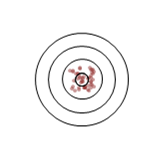
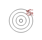
| Precise and accurate |
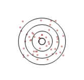
Precise | Accurate | Neither |
That seems fair enough, right? But wait! What’s with that third target? The shots are spread all over the place but it’s labelled as accurate. If you look at any one of those shots you would be hard pressed to call it accurate, some are outside all of the rings. What’s going on?
The thing is, we’re not talking about a single measure. As is typically the case we are labelling an aggregation of many measures. In these illustrations there are 50 ‘shots’. Accuracy is a term describing the groups tendency towards the desired target; specifically here, how far the average X,Y position is from the centre of the target. Precision describes the variation of results; here the variation of each shot from the average.
Looking again at that third target with this in mind we can see that the average position of the shots is somewhere near the centre (high accuracy) but they are quite spread out (low precision).
I don’t know about you but I’ve never been asked to give statistical analysis of peoples marksmanship (more’s the pity), so let’s make this look more like the kind of thing we see every day. I generated these images within Excel specifying a centre for each group and how much spread each ‘shot’ should have from this point. This way I could adjust the accuracy and precision independently. I added a ‘random’ element (RANDBETWEEN) and numbered each shot. From here I could plot the results as a line chart. Let’s look through each one.
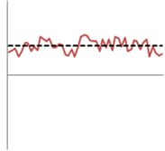
 First we see the line for the target labelled ‘Precise and accurate’. To simplify things I’ve only measured the shot’s height above or below the centre of the target (Y axis). The dashed line is the average (mean) of the series and you can see it sits almost exactly on the centre line of the chart (if you can’t see the centre line, that shows how close they are!)
The proximity of the average line to the centre is an illustration of how accurate this average is.
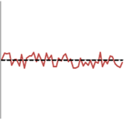
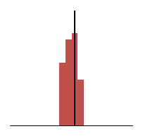
 The second, ‘Precise’, target is represented here. We can see that the points (shots) on the line are still closely grouped around the average. This shows the high precision of both of these models. The precision is a measure of how well the average represents the values within the set. This is where we run into terms such as ‘confidence level’ and ‘standard deviation’.
We can also see, however, that the average (dashed) line is quite a long way from the X axis. This distance is how inaccurate the result is. A real-world example of where you might see this is a measure of how many hours people work per day. By having a precise measure of their start and end times you can come to a very precise result for each person by subtracting one time from the other. However, if you forget to deduct the time they spend on lunch your highly precise measurement will be inaccurate (shifted up by the duration of the lunch break).
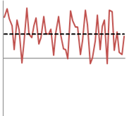
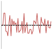 So this is what it looks like to be accurate but not precise. To continue the example of hours worked; this could represent staff working flexible hours. Each day may see someone work more or less than the average expected but they balance the hours out to average the correct amount over time.
The average line is close to the X axis so the average is accurate but there is a lot of deviation to the individual results so the average isn’t precise, or a good representation of any one result.
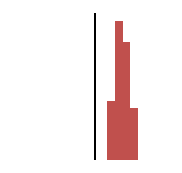
 Finally we see the results that are neither accurate nor precise. We see the average line is far from the centre and high deviation of result.
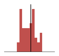
Below are histograms of the distribution of the results we’ve been looking at. Again, the more the centre of the results is to the target line the more accurate the average will be to it. The more tightly grouped the distribution is the more precise the measure.
 |
 |
 |
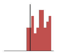 |
| Precise and accurate |
Precise | Accurate | Neither |